This paper presents a cross-disciplinary collaborative project between a poet and a book artist. A site-specific residency project in 2014 for MoAD in Old Parliament House, Canberra, gave rise to two other publishing artifacts: a chapbook (for a poetry audience) and an artists’ book (for a visual arts audience). The collaboration produced original poems, ‘cut-ups’ composed from in situ sources, poems composed of key-word anagrams, and erasure poems sourced from Hansard speeches and newspaper articles from the year 1962.
Each mode of publication offers different affordances for the source texts, offering them variable states of print-performance. The project also explores poetry’s relationship to public culture and institutions and the language these use. The poetic component in the project is an exercise in re-voicing and speaking back to the concept of a parliament, while the artistic component of the project is an exercise in close reading, both of the space itself and of the words inside it.
Keywords: poetry – collaboration – print-performance – creative publishing – re-voicing
This paper explores the processes and ideas that we used together as writer and artist as a major project within the creative component of Caren’s doctoral research. Caren is interested in opening up and subverting traditional relationships between writer and publisher.
She invited a number of poets to collaborate with her in an active way, drawing upon Umberto Eco’s thinking about the open work, where he uses music as an example of performing and re-performing ideas as creative iterations (1979: 47-66). The open possibilities of the artist book provided a unifying element across the different collaborations. Caren’s letterpress studio performed both as a contributing network (drawing loosely upon Bruno Latour’s (2012 [1990]) dissolving of machine/human distinctions) and as a creative constraint, providing limitations of choice that offered distinct solutions, even when working digitally. For this collaboration, Melinda’s interest in re-voicing institutional texts shaped our project, and we both found Kenneth Goldsmith’s writings on found texts to be particularly useful in contextualising our intuitive actions.
Wayfinding
In 2014 Craft ACT and the Museum of Australian Democracy (MoAD) jointly released an exhibition/residency call-out inviting artists to respond creatively to particular rooms and objects to form a nested exhibition within an existing permanent exhibition in Old Parliament House (OPH) in Canberra. As typographer and poet, we share an interest in voicing and re-voicing text, and had been looking for a collaborative project that suited our respective interests. We successfully tendered for the MoAD ‘Sign Room’, a collection of hand-lettered signs outlining rules, regulations and directions for negotiating the building and its activities. This isolated cluster of vintage wayfinders provided the conceptual framing for what became a three-year collaborative publishing project and a significant portion of Caren’s PhD research.
Melinda developed a strong poetry career alongside her day job in the public service, until she was liberated to write professionally by winning the Prime Minister’s Literary Award in 2014. Her education included a double degree in Law and Japanese; this focus on language and translation means that she has a particular interest in institutional idioms, and is adept at negotiating legal, political and historical records. Her poetry uses a wide variety of forms, including those that puzzle within creative constraints such as anagrams and acrostics.
Caren’s artistic practice is strongly informed by her English Literature degree and the typographic design thinking that comes with a constant engagement with letterpress equipment. She has built up a personal letterpress studio that performs as a discrete network of distributed knowledge, able to be negotiated according to the demands of particular projects. The creative constraints it imposes by having particular analogue limitations flow through to inform her digital solutions.
The exhibition in question was to be called Bespoke: Design for the People. The broad aims of the exhibition brief gave us an interesting starting point: our work, to be on display for a full year, was meant to bring a fresh perspective to a permanent display (Furnished: Suites, Seats and Suits) and to engage a broad public audience, many of whom were school children on excursion, sent as a nationwide ritual to experience their nation’s capital.[1] We wanted to combine our creative writing and visual arts skills in an experimental act of material poetics, and then continue working together to extend and transcreate our ideas in a way that could cross over to our respective poetry and book arts communities[2] so that we had professional outcomes that worked for our respective practices. We planned an artist book, to allow ourselves the freedom to expand our ideas visually, and a poetry chapbook, to showcase Melinda’s poetry. Each not only has a different audience but different material opportunities.
Reading the room
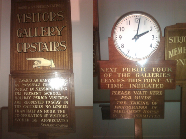
We visited the MoAD sign room regularly, and every time we entered we made new observations. There was a wall-clock up in the corner of the glassed-in space, its hands frozen at two minutes to eight; and a sign-clock that cast a shadow resembling the War Memorial. The gauze curtains behind us muted the long thrown shadows of the window’s Union Jack ironwork railings. The laid-out newspaper from the mid-20th century told stories of large world events that were already a few days old by the time they were reported, mixed up with local stories of car crashes and regional farm activity. There were cordoning ropes and glass preventing close contact with the objects, and a beautiful stuffed leather chair that we were not permitted to sit on.
We were not sure at first what to do with the signs. It was also a newspaper-reading room: should we make a book and display it on the purpose-built cabinet? There was a lot of empty wall-space; should we make broadsides? We kept coming back to our first scouting visit, when we’d ‘met’ the signs and riffed about their various ‘personalities’, with their different heights, shapes and hand-painted scripts.
The only stipulation made by the exhibition call-out was a responsiveness to the space and its history. We felt that establishing creative constraints would help negotiate the task. Creative constraint does not have to be pre-determined; it can arise as contingency when problem-solving. Once the constraint is recognised and accepted, it can unfurl/unfold into possibility. We worked both ways: we had already factored in the pre-determined constraints of my letterpress studio and its equipment but we then identified the site itself as a contributing agent, with its own distinct palette and textual lexicon.
In order to negotiate with the site, we started with a close reading of what the signs themselves were offering. This reading was a generative activity: Melinda transcribed their text, and Caren parsed their physical features. As Latour recommends, we ‘turned … attention on hard things, and [saw] them become gentle, soft, or human’ (2012 [1990]: 19) They were wooden, varnished in various glossy brown tones, with gold and black imperfect lettering, thanks to the hand-painted calligraphy executed by in-house sign-writers. They had page-faces, sturdy feet, and occasionally hands (manicules: hand symbols with pointing fingers), which evoked personhood. They were a closed network of preserved knowledge, their texts in conversation with each other but set apart from us by glass and time. We wanted to set them back into the thoroughfares, allow them to connect with the present, if only through our pages.
Moving outwards, to work with the material significations of the environment, we thought about the nature of the OPH building itself, completed in 1927: solid (dependable), white (pure) with pared-down geometric ‘stripped classical’ elements (ordered) that deliberately evoked the British Empire’s Union Jack (authority), and with wood and leather (masculine) furnishings. We decided that these elements should be used as a visual palette. Melinda also determined that the poetic techniques, idioms and allusions she used would have a distinctly 20th century flavour.
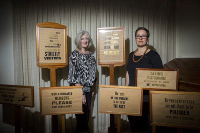
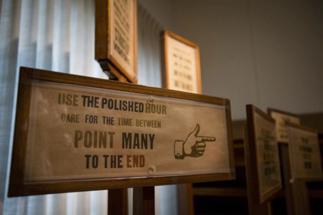
After a few brainstorms, Melinda tried some word play using only the transcribed text. She cut, rearranged, and rebuilt to create a corresponding cluster of words in poetic dialogue with the originals, re-contextualising their messages into absurd commands with wry pokes at the aura of authority and entitlement projected from the original signs. It was focused on generating meaning that drew the reader back to the original objects. The result was a classic détourne in the tradition of the French situationists (Goldsmith 2011: 36-51).
Here are some examples:
ONLY about HALF THE PUBLIC ARE APPRECIATED
TAKE NO NOTICE
Members ARE ONLY REPRESENTATIVES
REPRESENTATIVES are STRICTLY VISITORS
And
GALLERIES of the set apart
ONLY THE ALLOWED
ONLY THE PERMITTED
Only in THIS HOUSE
NOT THE NEXT
This method of composition utilises the particular creative constraint of ‘found writing’, or what Kenneth Goldmith calls ‘uncreative writing’ (2011): we used the words in the space, about the space, to generate a new work. Goldsmith’s basic thesis is that no matter the source of the text, the borrowing author retains a powerful capacity for choice in how that text is managed, parsed, organised and distributed; these decisions are what makes the writing creative and distinctive (2011: 9).[3] We used a very basic form of this methodology at this point, but later, with the next iteration, Melinda expanded her approach, and it became much more nuanced.
Being in the space together discussing our joint and individual reactions felt radical, democratic. The fact that we were experiencing this together as a unit subverted the traditional writer/printer relationship: this was not a straightforward transaction of a body of writing delivered to be published: we experienced the space of compositional interest together, both of us forming ideas and concepts that could be merged and collaboratively negotiated.
The presentation of the signs in a contained, spot-lit room had its own affect: there were evocative thrown shadows (threat) and implied conversations between the objects (conspiracy). We liked the idea of exploring dialogue, with one set of signs (official) behind the protection of glass and another new set of signs (the people) standing in public space, facing them, evoking the social history of the building (government/function) and converting that government message (unity/one nation) into polysemic response (debate/democracy/dissent/satire).
Happily the MoAD staff were open to this idea, and we were able to go together to the MoAD archives to find some unused sign-stands.[4] We selected a variety of original ‘retired’ signs for which Caren letterpress-printed new page-faces using hand-set wood type (wood) in black ink (authority) with sections of embossing powder highlights (gold) on brown paper (historical tone). At one point during the initial experimental printing she realised that we could use the black ink and gold foiling powder intermittently to further play with the textual reading, a playful mark-up of key words[5].
The resulting work was slyly subversive, a sign cluster of institutional actants that felt like a small crowd of varying heights, weights and ages facing off the authority of the originals and their attendant historical contexts. While intentionally playful in tone, the re-mixed signs problematised the posited categories of ‘representatives’, ‘members’ and ‘visitors’, and pointed up the temporary nature of parliaments and the buildings that house them.
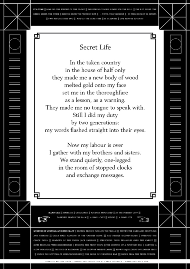
On the wall, so subtly designed to fit the OPH setting that it was perhaps overlooked, we also included a large digitally-printed and framed poetry broadside, featuring four original poems by Melinda about the building and the signs. The main one of these, ‘Secret Life’ (see Image 5), took its title and some of its atmosphere and structure from ACT region poet David Campbell’s ‘The Secret Life of a Leader’ (Campbell 1989). Campbell’s poem is a dramatic monologue that engages with the politics of the 20th century, especially totalitarianism, but explores it via a personal dimension. Melinda’s poem became a dramatic monologue in the voice of a sign, reflecting on its ‘life’ and evoking the small and large violences often perpetrated on citizens in the service of a state. The last line of the poem, ‘and exchange messages’, is also a reference to the last stanza of Auden’s poem ‘September 1, 1939’. (Auden 1940).
The installation remained on display from November 2014 to November 2015. Several visitors nominated Be Spoken To as their favourite work in the exhibition.
1962: Be Spoken To: artist book
The initial plan to expand our project to different publishing formats was a recognition that we wanted to use this opportunity to imbed social and political commentary into our response to the site. The MoAD residency generated a lot of ideas and texts for us, but we were wary of using some of them in the broad exhibition because some of them may have been a bit too politically pointed for that particular situation; Caren is not adverse to a good political punch,[6] but Melinda was at that time a public servant and there are (increasingly) strict rules about their expression of partisan opinion.[7] The ‘uncreative writing’ process was exciting for both of us. We had a variety of texts: original responsive poems, the recycled sign texts that had been used in the installation plus others that hadn’t, lists of computer-generated anagrams from words and phrases that had caught our eyes, and tentative ideas for further writings. The way we planned to work was to hand-print a tabloid-sized book, reminiscent of the newspapers we had browsed in the reading room near the signs, using affordances of the letterpress studio as a design constraint to pull together these words in a print-performed theatrical manner. It was to tread a fine line between a fine press publication and an artist book.
Fine press publishing has strong ties to poetry, with a very traditional approach to its presentation. Printer Clifford Burke hand-printed a fine press book called Printing Poetry (1980) which is a rare thesis on an activity that has predominantly tacit rules. Even he has trouble being definitive, acknowledging that every poem and its setting needs individual attention. He frames the printer’s responsibility towards the reader and the text as response-ability, the ability to respond appropriately, to become familiar with the text before working with it (54). ‘While reading a manuscript,’ he says, ‘I try to see it in type in my mind’s eye, the way some people see the stage while reading a play’ (55). By saying this, he is implying that there are decisions to be made akin to stagecraft: sets, costumes, props, music, movement. For him these are things like paper choices, framing paratexts, ink colour, justification, all of which are instances of bibliographic code.[8] However, for all his hesitations, towards the end he says (echoing the institutional mindset that we encountered in the MoAD signs): ‘Much as a printer strives for some unique or individual expression in a book, it must be remembered that there are rules limiting gross individualism, rules imposed by no authority but function’ (82).
The contumacious culture of the artist book has shown no such revulsion against ‘gross individualism’; to the contrary, every challenge thrown up by the rise of the internet has been met by taking the book beyond its traditional boundaries. Text and image intertwine, battle, submit to or conquer the other on the stage of the book; indeed, as Phillip Cabau writes, ‘The artist’s book is not so much an alternative to a margin of the mainstream as it is a transversality between streams’ (2014: 8). We went into the making of our book knowing that we would have fun with it, that while we wanted to work with a wide variety of texts, we would do so with a singularity of vision and visual design, constructing a narrative of single purpose rather than an anthology of separate poems, and this is what would encourage it to be seen as an artist book.
We spent a few intensive days sitting together with endless cups of tea, laptops, paper and pencils, building the structure of the book. Caren’s notes say things like ‘each spread is a month/command’; ‘axis of symmetry = page fold’; ‘MS to explore a year of Hansard’. Another note says:
Artist books are usually one sustained idea => one poem, one text running through with many visual extensions… This is many poems sustaining many ideas => one cycle => the book is the unifying factor. Need to ground it in a parliamentary year => the life of the building.
Melinda trawled through Hansard and Trove[9] while Caren made rough sketches and lists. Somewhere in that day’s conversation, we chose 1962, plucked from the air when talking about the rights of Indigenous Australians; in that year they were uniformly enfranchised to vote in federal elections (Parliamentary Reporter 1962:10). It was also, we discovered later, the year Caren’s grandparents moved their family to Canberra.
Once we had a temporal anchor, we brainstormed entry points. Dividing the book into twelve months allowed the reader to move through the year by turning the pages. We wanted to create a poetic snapshot of 1962 that also crossed the boundary to our own time. Ostensibly an undramatic choice as opposed to an iconic year suh as 1927 (the year OPH was opened) or 1975 (the Dismissal), 1962 turned out to be very interesting. While Robert Menzies was solidly in power, we found Gough Whitlam building up steam as the Opposition Leader and the Cuban Missile Crisis and the Communist Party affecting the cigar-fugged calm. Canberra itself was transforming from a town in a paddock to a city with a lake.[10]
Re-reading our file of ideas, we rediscovered the phrase ‘slip me from my ghost bag’, stemming from the experience of encountering the Museum’s archival storage unit. It would introduce the notion of ghosts coming back to haunt, and invited the reader to be active: to pull forth and explore the object. We liked the idea of multiple voices speaking through the book, threaded by form, font and placement. One of those threads would be the Be Spoken To sign texts, ushering the reader through the ‘rooms’. Another thread was a series of ‘commands’ or situation statements, royally seated at the head of the centrespreads of each pagefold, as if carved in stone. They were mostly gleaned from Melinda’s poem ‘Secret Life’ (reproduced in Image 5 above as the main panel on the broadside) with three from ‘Museum of Australian Democracy’ (also on the broadside). The twelve lines used were also tied to the monthly themes and dates that we mapped out:
January: THIS IS STRIPPED CLASSICAL (architecture/OPH opening)
February: STAND ON THE TAKEN COUNTRY (landscape)
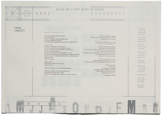
March: MAKE ME A NEW BODY OF WOOD (society/construction)
April: THE FACES OF THE DEAD ARE EVERYWHERE (health/ANZAC day)
May: SET ME IN THE THOROUGHFARE (women/feminism)
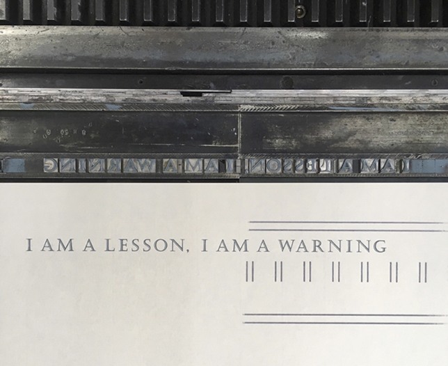
June: I AM A LESSON, I AM A WARNING (media)
July: I DID MY DUTY BY GENERATIONS (indigenous affairs)
August: EXCHANGE MESSAGES (Communism)
September: MY WORDS FLASH STRAIGHT INTO THEIR EYES (political change)
October: TIME IS A RED NEEDLE SWEEPING A CIRCLE (national threat/ Cuban Missile Crisis)
November: I HAVE NO TONGUE TO SPEAK WITH (commemoration/grief/Remembrance Day)
December: MY AIR IS A FUG OF CIGAR (masculinity/entrenched power)
Book artist Dick Higgins says that ‘Every time we turn the page, the previous page passes into our past and we are confronted by a new world’ (1996: 103). This echoes the movement through a conventional poetry book, in which each page holds a poem that is an encapsulated world. With 1962: Be Spoken To (1962 BST) we heightened this sense of movement through space: we included recognisable design elements that had been embedded by designer John Smith Murdoch to situate the book-object as Old Parliament House itself.[11] We choreographed each turn of the page to enact a movement in and out of framed rooms, achieved by screenprinting a linework structure on both sides of each page, based on Murdoch’s decorative elements, with slight tweaks (for example, adding a horizontal line to transform the building’s circular ironwork into the Aboriginal flag). It is printed cleanly and intact on the outer surfaces of the pagefold to frame the sign-text, and in a more fragmented way for the inner openings (the bibliographic term for a pagespread) that form rooms (Italian: stanza) which hover in time and place, populated by textblocks that are both human (stories) and furniture (letterpress term for spacing).
We built into the page design a typographical data-visualisation to reflect the number of parliamentary sitting days in 1962, with the size of each month’s initial (printed with wood type) reflecting the number of sitting days against ‘graph’ lines that formed the base of the screen-printed architectural page frame. The largest sitting month was August, with January, June, July and September having no sitting days. This parliamentary sitting calendar became our book’s (arrhythmic) heartbeat, but it meant that our idea of Hansard for the whole year hit a snag, so we decided that if we had a month that had no Hansard, we turned to newspapers, via Trove.
Hansard is a very special kind of text: an archive comprised mostly of direct speech. It is speech for official purposes, but this of course is part of the reason for making it into poetry. It is speech of the same flavour as the court transcripts used by Charles Reznikoff (1934-79)[12] and more recently the legal documents used by Vanessa Place in her Statement of Facts (2010),[13] but it also has a greater range of subject matter. Like Reznikoff there is a historical dimension too, in our use of Hansard from a generation ago (rather than contemporary verbatim documents such as Place uses). Poems made from Hansard draw their resonance primarily from the fact that they are made of the direct speech of elected representatives of our polity, addressing the reader out of the past as if through some ghostly radio set.[14]
If Goldsmith’s uncreative writing is ‘self-reflexive use of appropriated language’ (2011: 101), then a Hansard found poem or erasure poem is a species of uncreative writing. So too are the other elements we used to fill the ‘rooms’ of the book: found poems made from contemporary newspaper articles and poems made from anagrams of evocative phrases like ‘OFFICIAL SECRETS’ and ‘FLOOD PLAIN’.
Goldsmith characterises two approaches to appropriated text: Picasso’s candle (making a unified whole from collaged elements) and Duchamp’s mirror (presenting the appropriated content without comment and ‘throwing it back onto the thinkership (audience)’ (2011: 110-111) to come up with their own response). The approach taken to Hansard in the 1962: Be Spoken To poems is more akin to the mirror than the candle, although, because of the substantial editing/erasure involved in condensing a three or four page speech into a one page poem, it arguably has elements of both.
The process of searching for text strings in Hansard also inspired its own creative response: for the November 1962 spread Melinda composed a flarf-style poem (see Goldsmith 2011: 185-187) made up of Hansard search results (‘what you get when you search for silence’.)
As a final couple of unifying elements for readers to follow throughout the book, we used found text: a full, unedited quote from the Wikipedia article on stripped classical design,[15] and anagrams of the phrase ‘manicule point’. Caren’s contribution to the work became textual as well as artistic here: once Melinda had generated and selected her favourite anagrams of ‘manicule point’, it was Caren who selected which ‘manicule point’ anagram to use with each month, resulting in fortuitous groupings like ‘a nicotine lump’ to go with the Health-themed month (March 1962) and its Hansard poem ‘Health, On Notice’ taken from a House of Representatives question to the Health Minister about the effects of smoking (the anagram poem for that month is ‘Carcinogenic’).
In the way it is constructed, it is worth noting that 1962: Be Spoken To contains narratives of a number of different kinds: cyclical narratives (the regular reappearance of taglines and sign text), self-contained narratives (individual poems), and connected run-on narratives (such as the found Wikipedia text, which is separated into clusters of words that are spread sequentially through the pages), all located within the constructed episodic space of the 12-spread book which simultaneously represents time (the 12 months of 1962) and space (Old Parliament House itself).
At a practical level, this design of interweaving narratives meant we had created quite a complex and voluminous project for ourselves. We both ended up using a kind of matrix structure to conceptually organise and relate all the different elements and also to track when each had been completed. The texts themselves were handset in various typefaces, with both colour and font distinguishing the constructive elements, with some texts forming threads through the pages. For example, each ‘room’ had a central narrative poem, printed in sepia-brown English Garamond. This sat visually forward from the other page elements which were printed in shades of grey and grey-blue. The sign texts were printed in a rich gold, in keeping with their initial presentation in the Bespoke exhibition. There were subtle ornamental elements printed in cream, like a dotted clock-face in September, helping the ‘It’s Time’ poem to realise its ‘two minutes past two’ position on the page. One of the anagram poems, ‘Television’, has its title printed in Eurostile, a font designed in 1962 with its curved lines based on the curves of a television’s cathode ray tube screen (see Image 4, above). There are many small instances of these kinds of material poetics performed in the pages.
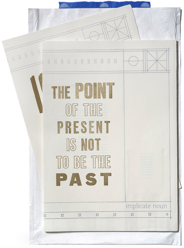
1962 Be Spoken To has two parts: 12 sections simply thread-stitched to form a light binding (to allow it to be read as a complete cycle without a formal cover impeding the movement from the end back to the beginning), and a separate title/colophon booklet. Each copy is housed in its own custom-made archival Tyvek ‘ghost-bag’. When it was first exhibited, at Caren’s exhibition Reading Spaces, it was displayed on a retired newspaper reading table from the National Gallery of Australia, at a gallery space in the Parliamentary Triangle in Canberra, within walking distance of both the NLA and MoAD.[16] Visitors to the exhibition sat on chairs made by Canberra designer Fred Ward and were encouraged to handle the book freely. One visitor feedback comment praised the fact that the materiality of the book slows down the reading. Every person who sat to read stayed for at least 15 minutes, far longer than the usual engagement with an artwork (estimated to be between 15 and 30 seconds). Thanks to Melinda’s networks, many of the gallery visitors were poets.
Members Only: poetry chapbook
An edition of six was planned for 1962: BST, but even with a policy of not wasting prints because of small mistakes (that are common with hand-rolled printing), only five managed to have no unforgivable flaws. Each book is therefore technically rare, an undemocratic artefact. When a copy is exhibited by us, the readers are able to touch and turn each page with their bare hands; if a copy is bought by an institution, there is a good chance that it will never be touched by ungloved hands again, and it will be exhibited behind glass, frozen in a double-spread tableau like the signs that inspired it.
Consequently, we wanted to make another version, one that was readily accessible. Members Only is a direct re-presentation of the artist-book, reformatted to suit the affordances of the print-on-demand (POD) process. It is a chance to extend the reach of Melinda’s poetry and our carefully-constructed book space, packaged as an affordable, easily distributed publication that can connect with her core readership.
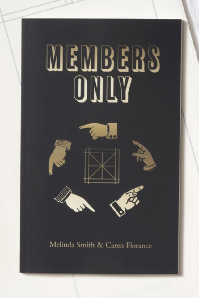
The artist book is large scale (505 x 357 x 14mm), whereas the chapbook far more compact (203 x 228mm), so we organised the flow slightly differently: each month starts with the sign text, framed with a simple double line. The next page spread has scraps of the original framework: the union jack and aboriginal flag squares at the head of the recto, with the bottom ‘data-vis’ graph lines and the relevant month’s initial at the tail of the verso. This is where each anagram poem is presented, using a digital sans serif font called Hypatia Sans Pro (named for the female mathematician and astronomer from the Byzantium empire). The next page spread has no ornamentation, and allows the primary poem of the month, which is typeset in the same typographic configuration as the original, to fully occupy the double spread unimpeded. So the rhythm of the chapbook, after the forematter, is a clear pulsing poetic metre of ABCABCABC for all twelve months. The small cream ornament details have been omitted, but the manicule anagrams still appear, and one thematic addition to differentiate it from the artist book is a proliferation of new manicules, with the sign text each matched playfully to the sign’s ‘mood’.
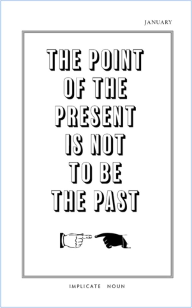
In Image 8, for example, the ‘point’ is one of racial awareness. In other months the hands look clerical, religious, wan, didactic, and in August, when the ‘Serjeant-at-arms’ does not appreciate photographs, we have taken full advantage of the digital environment to insert an (anachronistic) Facebook hand, pointing its thumb down.
This body of work was a truly collaborative effort, with both of us crossing the boundaries of our respective practices to undertake a mode of working that was contingent, playful and open to fluid outcomes. To have a carefully-planned research or working plan is to deny the playfulness that studio research demands, and brings the making space back into the realm of commission, or production. Despite all the planning and charts that Melinda and I drew up and navigated by, each part of the project was able to recalibrate its route in the face of new ideas or technical hitches. The books we produced are as much a souvenir of the processes we undertook together in the recent past as they are a deliberately constructed missive for the reader of the future. We have faith that this work’s myriad complexities will be teased out by its readers. As Melinda writes in our Foreword (only included in the chapbook):
As we listened to the voices heard in the building 55 years ago, we became aware of loud echoes in present-day debates ranging from public health to migrant accommodation. Some things have barely changed at all – and others have changed in very unpredictable ways. In composing and framing the texts, we have deliberately placed 1962 in conversation with the early 21st century. Eerily, these conversations are continuing: the ‘official secrets’ poem has quite suddenly come to seem like a poem about ‘alternative facts’, despite being written months before the phrase was ever uttered. … In the interaction of the found poems with the surrounding anagrams, sign text, and section titles, there are a number of intricacies which will (we hope) repay multiple readings. Please enjoy. (2017: 6)
Endnotes
[1] This is a Civics education policy initiated by John Howard’s government in 2006. Over 100,000 children visit Canberra every year, and there is a rebate for every school child who lives more than 150km from the ACT, on the proviso that certain institutions, including MoAD, are on the itinerary: http://www.pacer.org.au/ (accessed 1 July 2017).
[2] Transcreation, coined by Brazilian poet Haroldo DeCampos (2007 [1963]) is a recognition that exact translation is impossible and that each new work is a new creation based upon the original; it has been adopted in contemporary commercial industries as ‘a strategy to perform all the adjustments necessary to make a campaign work in all the target markets, while at the same time staying loyal to the original creative intent of the campaign’ (Pedersen, 2014: 58). Both uses are applicable with this project.
[3] At the time that we were reading Goldsmith, he was not a popular name to quote after an incident where he had pushed his found poetry methodology over a sticky ethical line (http://hyperallergic.com/190954/kenneth-goldsmith-remixes-michael-brown-autopsy-report-as-poetry/ (accessed 26 February 2017)). Nevertheless, his pedagogical and compositional methodologies remain useful; we are reminded of the ripples in the typography community when it was revealed that iconic designer Eric Gill had been committed to a life of broad sexual experimentation, which included wearing no underwear under his loose smock (in the 1920s), and sleeping with his sister, two of his daughters and his dog. Yet Gill remains one of the most enduring typefaces in use today (MacCarthy 1989).
[4] This is where we discovered ‘ghost bags,’ the simply-constructed and haunting white Tyvek slipcovers that the staff use to protect archived objects from dust and damage.
[5] Melinda did comment that this felt like ‘front end loading’ the interpretative process – usually left up to the reader - of deciding where the emphasis fell, and it also made it more difficult to leave text open to multiple interpretations. However she found it an interesting and challenging aspect of the collaboration that forced her to reflect on how this work normally takes place in the reading of a poetic text and how the effort is usually distributed between poet and reader.
[6] See http://trove.nla.gov.au/work/182914972?selectedversion=NBD51766462 (accessed 8 August 2017).
[7] Still: http://www.abc.net.au/news/2017-08-07/facebook-liking-anti-government-posts-could-cost-public-service/8780660 (accessed 9 August 2017).
[8] George Bornstein says that bibliographic code ‘include[s] features of page layout, book design, ink and paper, and typeface as well as broader issues … like publisher, print run, price, or audience. … I would like to emphasize here … its congruence with Benjamin's notion of aura. The bibliographic code corresponds to the aura and, like it, points to the work’s “presence in time and space.”’ (1999: 31).
[9] Trove is an invaluable Australian search engine uniting data from libraries, museums, archives and other research organisations. It is independent and maintained by the National Library of Australia. ‘Trove is many things: a community, a set of services, an aggregation of metadata, and a growing repository of fulltext digital resources.’ While we were building the book, funding to Trove was being slashed, so we printed #fundtrove in the book to (a) help raise support and (b) preserve that historical moment. http://trove.nla.gov.au/ (accessed 9 August 2017).
[10] Or, as I like to say, from a town in a paddock to a city in a paddock.
[11] John Smith Murdoch: https://www.moadoph.gov.au/collection/the-building/design-and-construction/ (accessed 9 August 2017).
[12] Testimony: The United States (1885-1915) – Recitative used verbatim witness testimony from court cases during the period reframed as poems. Reznikoff became the best known representative of the Objectivist school who all employed similar techniques. See also Goldsmith (2011: 105-108).
[13] Like Reznikoff and the Objectivists, Vanessa Place has also reframed legal documents as literature – in her case, statements of facts from court cases she works on in her day job defending sex offenders. Unlike Reznikoff’s witness testimony and Hansard, these are not direct speech, but objective-sounding, narrative-like legalese.
[14] Radio was already established as a medium by the time the building opened in 1927, and in fact the opening ceremony on 9 May 1927 was broadcast on ‘the modern wonder of wireless’ (The Mercury, Hobart, 10 May 1927: http://trove.nla.gov.au/newspaper/article/29672453 (accessed 9 August 2017).
[15] This Wikipedia text is the same text from which Melinda made erasure poems for October and December.
[16] Caren Florance, Reading Spaces, April 5-12, 2017 at East Space, Commonwealth Place, Parkes.
Auden, W H 1940 Another Time London: Random House
Burke, C 1980 Printing Poetry: A workbook in typographic reification, San Francisco, CA: Scarab Press
Cabau, P 2014 ‘Wire Dancers’, Journal of Artists Books, 35, 3-9
Campbell, D 1989 Collected Poems, Sydney: HarperCollins Publishers
Canberra Times 1962 ‘Parliamentary Summary: Bill on Voting Rights Passed’, 2 May 1962: 10
Eco, U 1979 ‘The poetics of the open work’, in The Role of the Reader: Explorations in the Semiotics of Texts. Bloomington, IN: Indiana University Press: 47-66.
Florance, C and Smith, M 2014-2017 1962: Be Spoken To, Canberra: Ampersand Duck
Goldsmith, K 2011 Uncreative Writing: Managing Language in the Digital Age, New York, NY: Columbia University Press
Higgins, D 1996 ‘A Book’, in J Rothenberg and D Guss (eds) The Book, Spiritual Instrument, New York, NY, Granary Books, 102-104
Latour, B 2012 [1990] ‘How to do words with things’, in S Bailey, A Keefer, and D Reinfurt (eds) Bulletins of the Serving Library 3: Ecstatic Alphabets/Heaps of Language, New York, NY: Dexter Sinister, 7-20
Place, V 2010 Statement of Facts, Los Angeles, CA: Blanc Press, 3 vols
Reznikoff, C 1934-1979 Testimony: The United States (1885-1915), Recitative, Santa Barbara, CA: Black Sparrow Press, 2 vols
Smith, M and Florance, C 2017 Members Only, Canberra: Recent Work Press/Ampersand Duck